
Client Search Performance Presentation Examples and Templates
SERPView Team
SEO Analytics

A client-ready search performance deck has exactly 10 slides. Lead with an executive summary, then move through objectives, a Google Search Console snapshot, top queries and pages, trend charts, device and country breakdowns, quick wins, recommendations, an appendix, and a next-steps close. That sequence works because it mirrors how decisions get made: verdict first, evidence second, action third.
Here is the 10-slide baseline sequence:
- Slide 1: Executive summary (one-sentence BLUF + one headline metric)
- Slide 2: Objectives and KPIs (agreed goals, measurement period)
- Slide 3: Search performance snapshot (total clicks, impressions, CTR, average position from GSC)
- Slide 4: Top queries and top pages (ranked by clicks or impressions)
- Slide 5: Trend chart (traffic, CTR, or position over time with annotated events)
- Slide 6: Device and country breakdown (mobile vs. desktop, top markets)
- Slide 7: Quick wins (queries ranking position 4–10 with high impressions)
- Slide 8: Recommendations and roadmap (prioritized actions with impact estimates)
- Slide 9: Appendix (metric definitions, date ranges, data notes)
- Slide 10: Next steps (owner, deadline, follow-up format)
Template sources to start from:
- PowerPoint: SlideModel’s client presentation templates offer a 12-slide agency deck with a problem-solution structure you can strip down to 10 slides and repopulate with GSC data.
- Google Slides: SlideGeeks provides free and premium slide decks with editable chart placeholders suited to search metric layouts.
- GitHub template: The GSC performance report template gives you a pre-structured markdown outline you can convert into slides in minutes.
Per-client customization checklist:
- Replace demo KPIs with the client’s agreed targets (organic traffic goal, CTR benchmark, position target)
- Set the date range to match the reporting period (28 days, 90 days, or quarter)
- Rename all slide headers with the client’s brand and property URL
- Swap placeholder chart data with exported GSC CSV values
- Confirm the property scope (single domain, subdomain, or Search Console set)
Key Takeaways
A client search performance presentation built on the 10-slide sequence, with GSC data verified before presenting, consistently produces faster client decisions than open-ended data dumps.
| Point | Details |
|---|---|
| Use the 10-slide sequence | Cover executive summary, KPIs, snapshot, queries, trends, device split, quick wins, roadmap, appendix, and next steps. |
| Match chart to metric | Use line charts for clicks/impressions trends, ranked tables for top queries, and donut charts for device splits. |
| Quick wins drive decisions | Filter GSC for position 4–10 queries with high impressions; calculate estimated click uplift before presenting. |
| Verify before presenting | Confirm CSV totals match GSC dashboard figures and document the aggregation method in the appendix. |
| Serpview extends GSC exports | Serpview provides up to 50,000 rows, shared dashboards, and pre-built reports that map to each slide in the deck. |
Table of Contents
- What makes a client-facing slide actually readable?
- What goes on each slide in the 10-slide deck?
- Which chart type fits each search metric?
- Where to find slide templates and how to adapt them
- How to deliver the deck and get a clear decision
- Build three slides from a real GSC export
- Appendix materials and the handoff checklist
- What I actually do differently when building these decks
- Serpview makes client-ready search decks faster
- Sources
- FAQ
What makes a client-facing slide actually readable?
Good slide design for search data is not about aesthetics. It is about reducing the cognitive load on someone who has 30 seconds per slide. Every design choice either helps or hurts that goal.
Answer-first copy. Every slide headline should state the conclusion, not the topic. “Organic clicks grew 18% quarter over quarter” beats “Organic Traffic Overview” every time. Pair that headline with one supporting metric in a large font directly below it. The rest of the slide is evidence for that claim.
Visual hierarchy. Use a maximum of two font sizes per slide: one for the headline (28–32pt) and one for body text or chart labels (14–16pt). High contrast between text and background is non-negotiable. The W3C Web Content Accessibility Guidelines recommend a contrast ratio of at least 4.5:1 for normal text. That standard applies to slides just as much as web pages.
One chart, one insight. If a slide needs two charts to make its point, it is actually two slides. Split it. Clients remember one clear takeaway per slide; they forget everything on a slide that tries to say three things at once.
Data density. Resist the urge to show every metric you tracked. Pick the one number that answers the question the slide is asking. Use a supporting table only when the client needs to verify individual rows, not as the primary visual.
Annotation habits. Mark every anomaly on a trend chart. A traffic spike with no label creates more anxiety than confidence. Label the date and the cause: “March 12 — site migration,” “April 3 — content refresh.” When you cannot explain an anomaly, say so explicitly rather than leaving it unlabeled.
Pro Tip: When a table communicates the data more clearly than a chart, use the table. A ranked list of top queries with clicks and CTR is faster to read as a table than as a bar chart with 20 bars.
Effective data visualization for search reports follows the same principle: the visual format should serve the data, not the other way around.
What goes on each slide in the 10-slide deck?
Each slide has a job. Here is the exact content, visual type, and a sample talking line for each one.
-
Executive summary. Purpose: give the client the verdict in under 10 seconds. Show one headline metric (e.g., total clicks for the period) and a one-sentence BLUF. Visual: large stat card with a directional arrow. Talking line: “Organic clicks are up 22% versus last quarter, driven by three high-intent queries we’ll walk through in a moment.” A short, outcome-first executive summary dramatically increases decision velocity in client meetings.
-
Objectives and KPIs. Purpose: anchor everything that follows to agreed goals. Show the KPI name, the target, and the current value side by side. Visual: simple two-column table or scorecard. Talking line: “We set a CTR target of 4.5% for branded queries. We’re at 5.1% — above target.” For KPI-driven SEO reporting, this slide prevents scope creep by making the success criteria explicit before the data appears.
-
Search performance snapshot. Purpose: give the period-level numbers in one place. Show total clicks, total impressions, average CTR, and average position from the GSC Performance report, which defines each metric precisely. Visual: four stat cards in a 2×2 grid. Talking line: “These four numbers are your search health indicators for the quarter.”
-
Top queries and top pages. Purpose: show what is actually driving traffic. List the top 10 queries by clicks and the top 10 pages by clicks in two side-by-side tables. Visual: ranked tables with a CTR column. Talking line: “Your homepage and the product comparison page together account for 41% of all organic clicks.”
-
Trend chart. Purpose: show direction and momentum. Plot weekly or monthly clicks and impressions over the reporting window. Annotate any significant events (algorithm updates, content changes, technical fixes). Visual: line chart with event markers. Talking line: “The dip in February aligns with the site migration — recovery was complete within three weeks.”
-
Device and country breakdown. Purpose: reveal audience composition. Show mobile vs. desktop split for clicks and CTR, and list the top five countries by impressions. Visual: donut chart for device, bar chart for countries. Talking line: “Mobile accounts for 68% of impressions but only 54% of clicks — the mobile CTR gap is worth investigating.”
-
Quick wins. Purpose: give the client something to act on immediately. List queries ranking position 4–10 with high impressions and current CTR below the site average. This is the highest-value tactical content you can present in a short review, per the GSC performance report template. Visual: table with columns for query, position, impressions, CTR, and estimated click uplift. Talking line: “These eight queries are one title-tag update away from a measurable traffic gain.”
-
Recommendations and roadmap. Purpose: translate data into decisions. List three to five prioritized actions with owner, estimated impact, and timeline. Visual: priority matrix or simple table. Talking line: “We’re recommending these three changes in the next 30 days based on effort-to-impact ratio.”
-
Appendix. Purpose: give analysts the detail they need without cluttering the main deck. Include metric definitions, date ranges, aggregation notes, and any data caveats. No talking line needed — this slide is for reference, not presentation.
-
Next steps. Purpose: close the meeting with a clear commitment. List the agreed actions, owners, and the date of the next review. Visual: simple action table. Talking line: “Before we close, let’s confirm who owns each item and set the next check-in.”
Pro Tip: For executive audiences, present slides 1–3 and 8–10 only, then offer to walk through the supporting slides if questions arise. For marketing operations teams, present all 10 slides and leave time for the appendix.
Which chart type fits each search metric?
Matching the right visual to each metric is where most search performance reports lose their audience. Here is a direct mapping.
| Metric | Recommended chart | When to use it | Sample annotation pattern |
|---|---|---|---|
| Clicks over time | Line chart | Showing trend direction and momentum | “March 12: site migration — 3-week recovery” |
| Impressions over time | Area chart | Showing volume scale alongside clicks | “April 3: content refresh — impressions +31%” |
| CTR by query | Horizontal bar | Comparing CTR across top 10–20 queries | “Below-average CTR: title tag opportunity” |
| Average position by page | Dot plot or table | Identifying pages near page-one threshold | “Position 4–10: quick win candidates” |
| Device split | Donut or stacked bar | Showing mobile vs. desktop composition | “Mobile CTR gap: UX investigation needed” |
| Country breakdown | Bar chart | Ranking markets by impressions or clicks | “UK: 18% of impressions, 9% of clicks” |
A few principles govern these choices. Use a time series for any metric where direction matters more than the absolute value. Stacked area charts work well for device or channel splits because they show both the total and the composition simultaneously. For top queries and pages, a ranked table beats a chart because clients want to read the actual query text, not interpret a bar length.
When choosing the headline metric for a slide, clicks are the most intuitive for executives. CTR is more useful for diagnosing conversion problems. Average position requires context because a shift from 8.2 to 7.1 sounds small but can represent a significant traffic opportunity.
Annotating anomalies is not optional. Experiment-backed annotations on trend charts, such as marking the exact date of a technical change or content push, give clients a causal explanation rather than a mystery. Without them, every dip becomes a crisis conversation.
Pro Tip: Use impression-weighted averages when reporting average position shifts. A query with 50,000 impressions should carry more weight than one with 200. Show both the unweighted and weighted values when they diverge significantly, and note the aggregation method in the appendix.
Visualizing search data for agency clients covers additional chart patterns for multi-property and multi-market reports.
Where to find slide templates and how to adapt them
Template sources:
- SlideModel provides professionally designed PowerPoint and Google Slides decks with pre-built chart placeholders, a problem-solution structure, and editable KPI scorecards. The client presentation template is the most practical starting point for a search performance deck.
- SlideGeeks offers free and premium PowerPoint templates with data-visualization layouts you can repopulate with GSC exports.
- GitHub GSC template gives you a pre-structured report outline with sections for metrics, top queries, quick wins, and device breakdowns — convert it to slides by copying each section into a new slide.
- PowerPoint’s built-in chart editor handles CSV imports directly, so you can paste GSC export data without a third-party tool.
Quick workflow to adapt a template:
- Export your GSC data as a CSV from the Performance report (queries, pages, countries, devices tabs separately).
- Open the template in PowerPoint or Google Slides and delete any slides that do not map to the 10-slide sequence.
- Paste each CSV into the corresponding chart’s data editor. For line charts, use the date column as the X-axis and clicks or impressions as the Y-axis.
- Replace all demo text with client-specific copy: brand name, property URL, reporting period, and agreed KPIs.
- Apply the client’s brand colors to chart fills and slide backgrounds. Keep text contrast above 4.5:1.
- Add event annotations to the trend chart slide (migration dates, content launches, algorithm updates).
Template adaptation tips. Replace every demo number with the client’s actual figures before the first review. Shorten slide copy to one headline and two supporting data points per slide. Add a data provenance note in the footer: “Source: Google Search Console, [property], [date range].”
Permission note. Before using a past client’s deck as a case study or template example, anonymize all brand names, URLs, and proprietary metrics. Get written permission before sharing any identifiable client data externally. AI tools can speed slide creation, but always validate the output against your actual GSC export before presenting.
Pro Tip: Keep a master template file with your agency’s branding already applied. Each new client engagement starts from that file, not from a blank deck. You will save 45–60 minutes per report cycle.
How to deliver the deck and get a clear decision
The presentation itself is where many technically strong reports fail. The data is right, but the meeting ends without a decision.
Answer-first script pattern. Open every client meeting with the BLUF from slide 1: one sentence stating the period result, one supporting fact, and one recommended action. “Organic traffic grew 18% this quarter. The growth is concentrated in three product pages. We recommend expanding that content cluster in Q3.” That is the entire opening. Do not build to the conclusion — start there.
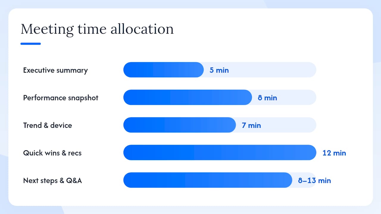
Time allocation for a 30–45 minute review:
- Executive summary and objectives (slides 1–2): 5 minutes
- Performance snapshot and top queries (slides 3–4): 8 minutes
- Trend chart and device breakdown (slides 5–6): 7 minutes
- Quick wins and recommendations (slides 7–8): 12 minutes
- Next steps and Q&A (slides 9–10): 8–13 minutes
Reserve at least 25% of the meeting for discussion. A deck that takes 40 minutes to present leaves no room for the decisions you came to make.
Handling common questions. When a client asks why their GSC data differs from their analytics platform, explain that GSC metrics measure search-result interactions (clicks from Google’s results page), while web analytics measure sessions after landing. They measure different things. When asked about a traffic drop, explain the specific cause if you know it. If you do not, say so and commit to a follow-up date. Vague reassurance destroys credibility faster than an honest “we’re investigating.”
Storytelling. One client-specific narrative makes the metrics tangible. Pick a single page or query that had a clear before-and-after story during the period: a title tag change that lifted CTR, a content update that moved a page from position 9 to position 3. Walk through that one example in detail. It gives the client a mental model for how the other recommendations will work.
Pro Tip: Prepare a one-page leave-behind that summarizes the three recommended actions, the owner for each, and the expected outcome. Clients who leave with a physical or PDF summary are more likely to act on recommendations than those who only saw the slides.
For quarterly marketing meeting preparation, structuring the agenda around decisions rather than data reviews consistently produces better outcomes.
Build three slides from a real GSC export
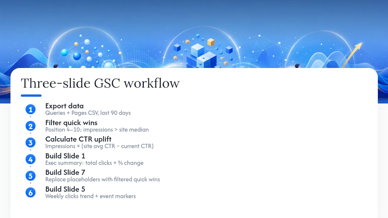
This walkthrough produces three presentation-ready slides from a standard GSC export. You can reproduce it with any active Search Console property.
Step 1: Export the data. In GSC, open the Performance report. Set the date range to the last 90 days. Export the Queries tab and the Pages tab as separate CSVs. Each file contains query or page, clicks, impressions, CTR, and position.
Step 2: Filter for quick-win queries. In the Queries CSV, filter for rows where position is between 4 and 10 and impressions are above your site’s median impression count. These are your quick-win candidates. Sort by impressions descending.
Step 3: Calculate CTR uplift. For each quick-win query, estimate the click uplift if CTR improved to the site average for that position band. A simple formula:
Estimated additional clicks = Impressions × (Target CTR − Current CTR)
If a query has 8,000 impressions and a current CTR of 1.8% against a site average of 3.5% for position 5, the estimated uplift is 8,000 × (0.035 − 0.018) = 136 additional clicks per period.
Step 4: Build Slide 1 (Executive Summary). Headline: “[Client name]: Organic search, [date range].” Stat card: total clicks for the period with a percentage change versus the prior period. One supporting sentence: “Growth driven by [top 3 queries].” Source note in footer.
Step 5: Build Slide 7 (Quick Wins table).
Replace the placeholder rows with your filtered GSC data.
Step 6: Build Slide 5 (Trend chart). Plot weekly clicks over the 90-day window as a line chart. Add vertical event markers for any site changes, content launches, or algorithm updates during the period. Custom annotations on trend charts give clients a causal explanation for every notable movement.
Data accuracy check. Before presenting, verify that the total clicks in your CSV match the total shown in the GSC dashboard for the same date range and property. GSC applies aggregation differences between the chart view and the table view — document which view your export came from in the appendix.
Pro Tip: Always note whether your average position figures are property-aggregated or page-aggregated. The two values can differ substantially for sites with many URLs. Document the aggregation choice in the appendix so a subsequent analyst can reproduce your numbers.
Appendix materials and the handoff checklist
A well-structured appendix is what separates a one-time presentation from a reusable client asset. It lets the client verify every number and lets a new analyst pick up the work without a briefing.
Appendix items to include:
- Metric definitions (clicks, impressions, CTR, average position as defined by GSC)
- Date range and comparison period for every chart
- Aggregation notes (property-level vs. page-level average position)
- Sampling or partial data caveats (GSC samples data for very large properties)
- Data source for each chart (GSC export date, property URL, tab name)
Handoff best practices. Name files consistently: [ClientName]_GSC_[YYYYMMDD]_[ReportType].csv. Include a short readme in the client folder that lists the files, their contents, and the date they were exported. Set permission levels on any shared dashboard so the client can view but not accidentally modify the source data.
Handoff checklist:
| Item | Description | Status |
|---|---|---|
| Raw GSC export (Queries) | CSV from Performance > Queries tab, 90-day range | ☐ |
| Raw GSC export (Pages) | CSV from Performance > Pages tab, 90-day range | ☐ |
| Raw GSC export (Countries) | CSV from Performance > Countries tab | ☐ |
| Raw GSC export (Devices) | CSV from Performance > Devices tab | ☐ |
| Chart source files | PowerPoint or Google Slides file with editable charts | ☐ |
| Data transformation notes | Notes on any filtering, averaging, or formula applied | ☐ |
| Appendix slide | Metric definitions, date ranges, aggregation notes | ☐ |
| Readme file | File list, export dates, property URL, contact | ☐ |
| Shared dashboard link | View-only link with correct permission level | ☐ |
Shared dashboards let clients access live data between reporting cycles without requiring a new export each time.
What I actually do differently when building these decks
Most search performance presentations fail not because the data is wrong, but because the presenter tries to show everything. The instinct to be thorough works against you in a client meeting.
My actual practice: I build the quick-wins slide first, not last. It forces me to identify the highest-value finding before I write a single headline. If I cannot find three credible quick wins in the GSC data, the deck is not ready. That constraint also tells me whether the reporting period was long enough to produce actionable signal.
For executive audiences, I cut the deck to five slides before the meeting: executive summary, KPIs, quick wins, recommendations, and next steps. The full 10-slide version goes in the appendix as a leave-behind. Executives do not want to sit through a trend chart explanation — they want to know if the number went up and what you are doing about it.
On transparency: when the data shows something I cannot explain, I say so. “We saw a 12% impression drop in week six. We have three hypotheses and we’re testing them now.” That is more credible than a confident-sounding explanation that turns out to be wrong. Search quality practitioners consistently recommend explaining the ‘why’ behind query-level fluctuations rather than offering a single blanket reason for traffic changes. Clients who understand the complexity trust you more, not less.
The one thing most consultants underinvest in: the appendix. A thorough appendix with aggregation notes and export dates means the client can hand the file to their internal team six months later and the numbers will still make sense. That is what turns a one-time report into a long-term client relationship.
Serpview makes client-ready search decks faster
Building the 10-slide deck described here requires clean, complete data. Google Search Console’s native interface caps exports at 1,000 rows, which means you are missing the long-tail queries that often contain your best quick-win opportunities.
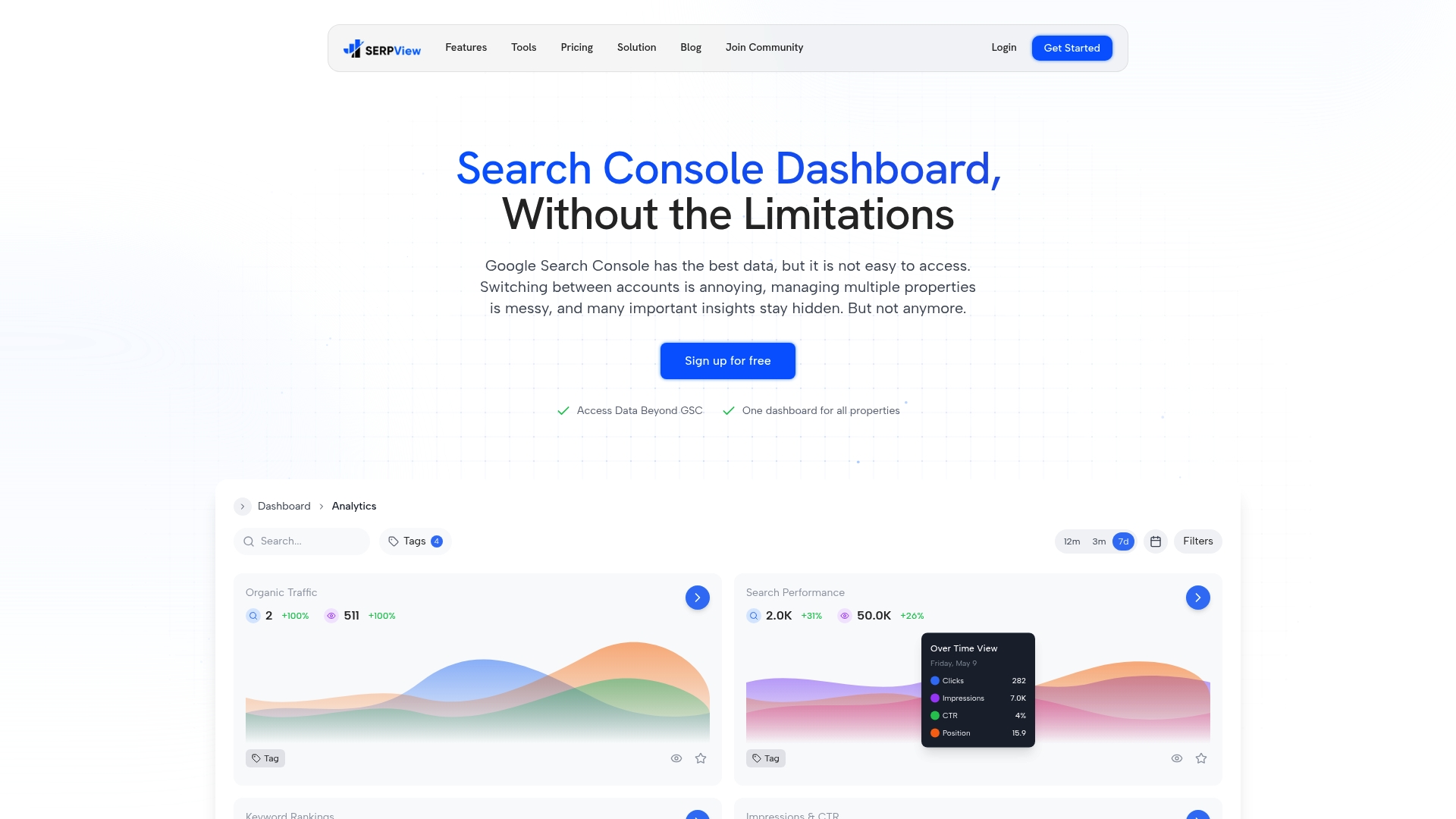
Serpview removes that ceiling. With exports up to 50,000 rows, you get the full query picture across all your client properties in one unified dashboard. CTR benchmarking, content decay heatmaps, and algorithm update overlays map directly to the trend and quick-wins slides in this deck. Pre-built reports mean the data is already structured for the slide sequence you just read. Shared dashboards let clients view live performance between reporting cycles without waiting for the next deck. If you want to understand the full scope of what Google Search Console tracks and where Serpview extends it, the glossary page covers both in plain language. Start your first client-ready report at Serpview.
Sources
- Performance report - Search Console Help
- How to Create a Winning Client Presentation | SlideModel
- Client Presentation Examples - Presenti AI
- Search Quality at LinkedIn
- Search speed: making Expedia flights faster | GitNation
- Optimization and search performance talk (Uber) | InfoQ
FAQ
What slides should every client search performance presentation include?
Every deck needs at minimum an executive summary, an objectives and KPIs slide, a GSC performance snapshot (clicks, impressions, CTR, average position), a quick-wins slide (position 4–10 queries), and a recommendations slide. The full 10-slide sequence adds trend charts, device and country breakdowns, an appendix, and a next-steps close.
What is the 5-5-5 rule for presentations?
The 5-5-5 rule suggests no more than five words per line, five lines per slide, and five text-heavy slides in a row. For search performance decks, the spirit of the rule applies: keep slide copy minimal and let the data visual carry the message.
What should you include in a client presentation?
A client presentation should include a clear executive summary, agreed KPIs with current performance against target, the evidence supporting your recommendations, and explicit next steps with owners and deadlines. Every slide should answer one question the client actually has.
What is the 7-7-7 rule for presentations?
The 7-7-7 rule recommends no more than seven lines of text per slide, seven words per line, and seven text-heavy slides per presentation. Like the 5-5-5 rule, it is a heuristic for reducing text density — useful as a starting constraint, but data slides often need a table or chart instead of text lines.
Can AI tools create a search performance presentation automatically?
AI tools can generate slide structures and suggest visuals, but they cannot replace verified GSC exports. Always validate AI-generated content against your actual data before presenting to a client, and tailor every slide to the client’s specific KPIs and reporting period.
Recommended
Ready to unlock your full GSC potential?
SERPView helps you access all your Google Search Console data without limitations. Start your free trial today.
Get Started Free