
Agency Benchmark Reporting Examples & Templates
SERPView Team
SEO Analytics

An agency benchmark report compares your client’s performance against a defined peer group, using the same metrics, timeframe, and normalization rules for both sides. The workflow is simple to state and hard to execute well: build the dataset, compare it against peers, interpret the deltas, then act on what you find.
A solid report always includes:
- KPIs that match the client’s goals, not a generic dashboard export
- A peer group filtered by size, spend, industry, or offer type
- A consistent timeframe (rolling 12 months, quarter, or year-over-year)
- Normalized data, so a $5,000/month account isn’t compared against a $50,000/month one without context
Grounding this in real standards helps. Benchmarketing uses percentile bands instead of flat averages, Mixpanel draws its numbers from billions of tracked events, and MetricNet applies a balanced scorecard to rank peer performance. Those three approaches show up, in one form or another, in nearly every credible benchmark report worth copying.
Key Takeaways
An effective agency benchmark report pairs a defensible peer group and consistent timeframe with percentile reporting, then converts every gap into an owned, dated action item.
| Point | Details |
|---|---|
| Define scope before metrics | Tie KPI selection to the specific client decision the report needs to support. |
| Use percentile bands, not averages | Report P25, median, and P75 so a single blended number doesn’t hide real spread. |
| Set a minimum peer-group size | Disclose sample size always, and treat fewer than five to eight peers as too thin to trust fully. |
| Automate the data pull first | Connecting sources and scheduling builds cuts report time far more than speeding up analysis. |
| Consolidate Search Console data with Serpview | Export up to 50,000 rows across properties instead of the standard 1,000-row cap when building benchmark datasets. |
Table of Contents
- Agency Benchmark Reporting Examples Worth Studying
- How Do You Create a Benchmark Report Step by Step?
- Which KPIs Should You Benchmark by Channel?
- How Do You Choose a Defensible Peer Group?
- What Do the Best Benchmark Scorecards Look Like?
- What Tools Automate Benchmark Data Collection?
- What Mistakes Undermine Agency Benchmark Reports?
- How Long Does a Benchmark Report Take to Build?
- How SERPView Speeds Up Benchmark Report Production
- Try the Faster Way to Build Benchmark Reports
- Sources
Agency Benchmark Reporting Examples Worth Studying
You don’t need to build a benchmark report from a blank page. The formats below are already public, already tested against real client questions, and each teaches a different lesson about structure or presentation.
-
Mixpanel’s State of Digital Analytics. Built from a dataset spanning trillions of tracked events across thousands of companies, this report shows channel-level engagement and conversion benchmarks at a scale most agencies could never replicate on their own. The takeaway to steal: when your sample size is small, borrow context from a large public dataset rather than pretending your 12 client accounts represent “the industry.” See Mixpanel’s benchmarks for the current release.
-
Klaviyo’s Email Marketing Benchmarks. This report breaks open rate, click rate, and conversion down by industry vertical, which matters because a 45% open rate in one sector might be mediocre in another. The lesson: never publish a single blended average for email metrics. Segment by industry first, and cite Klaviyo’s benchmark tables when your own sample is too thin to stand alone.
-
Semrush’s Digital Horizons. Semrush’s benchmark research pairs organic and paid search trends with cross-industry commentary, giving agencies a narrative layer on top of the raw numbers. The presentation style leans on trend charts over time rather than a single snapshot, useful when a client wants to see momentum, not just a static comparison.
-
Shopify’s Commerce Trends. This one benchmarks conversion rate, average order value, and cart abandonment across the commerce sector broadly, then breaks findings out by category. Agencies serving e-commerce clients can lift the category-level splits almost directly into a client scorecard.
-
Wistia’s State of Video. Wistia benchmarks video engagement, completion rate, and play rate, presented mostly through simple bar comparisons rather than dense tables. It’s a good model when your audience is less analytical and needs the finding at a glance rather than a spreadsheet.
-
Sprout Social’s Index. The Sprout report benchmarks social posting frequency, engagement rate, and response time by platform and industry, using a mix of ranked lists and comparison charts. It demonstrates how to keep a multi-platform report from turning into an unreadable wall of numbers: pick one hero metric per platform and lead with that.
-
MetricNet’s peer-group service-desk benchmark. This sample report uses a balanced scorecard with percentile bands (minimum, median, maximum) across metrics like cost per contact and first-contact resolution. It’s the clearest public example of percentile-band reporting done right, and it translates cleanly to marketing agency KPIs like cost per lead or time to first response.
-
AgencyAnalytics’ benchmarking guide. Built specifically for marketing agencies, this resource walks through which KPIs to track by channel and how to present them to clients without overwhelming a non-technical stakeholder. It’s less a single report and more a template library, which makes it useful as a starting structure rather than a finished example to imitate wholesale.
Notice the pattern across all eight: platform-driven reports (Mixpanel, Klaviyo, Semrush, Shopify, Wistia, Sprout) lean on scale and segmentation, while peer-group reports (MetricNet, AgencyAnalytics) lean on percentile bands and scorecards. A strong agency report usually borrows from both camps.
How Do You Create a Benchmark Report Step by Step?
Building one that clients actually trust follows five stages, in order. Skipping the scope step is the single most common reason a benchmark report gets challenged in a client meeting.
Start with objectives and scope; learn more about the importance of why measure SEO performance for agencies in this detailed guide. Ask what decision this report needs to support. A retention conversation needs different KPIs than a budget-increase pitch. Write the objective down before you touch any data.
Select KPIs and define the peer group. Choose metrics tied to the objective, then decide who counts as a peer. Filter by account size, industry, spend band, and geography. A peer group with fewer than five to eight comparable accounts is usually too thin to report with confidence.
Collect and normalize the data. Pull from your source systems, map field names consistently, and convert everything to the same units (percentages, per-thousand rates, or per-dollar-spend figures). This is where most reporting errors originate: mismatched date ranges or currency units that never get reconciled.
Analyze deltas and prioritize. Rank findings by size of gap and business impact, not by whichever number looks most dramatic. A 2-point delta on a KPI tied to revenue outranks a 20-point delta on a vanity metric.
Package deliverables with owners attached. MarketIntelligenceTools’ benchmarking template structures this as an executive summary, methodology appendix, performance comparison, implications, and an action plan with named owners and deadlines. That structure is worth copying directly.
| Stage | Primary Owner | Typical Output |
|---|---|---|
| Scope and objectives | Account manager | One-paragraph brief tied to client goal |
| KPI and peer selection | Analyst | Metric list and peer-group filter criteria |
| Data collection and normalization | Data engineer or analyst | Cleaned, unit-matched dataset |
| Delta analysis and prioritization | Analyst | Ranked findings list |
| Deliverable packaging | Analyst plus design | Executive summary, appendix, action plan |
A guide on KPI-driven SEO reporting covers how to tie individual metrics back to the business outcome a client actually cares about, which is worth a read before you lock your KPI list.
Which KPIs Should You Benchmark by Channel?
The right metrics depend entirely on channel, and mixing them into one undifferentiated dashboard is how reports lose credibility fast.
| Channel | Primary KPIs | Central Tendency Guidance |
|---|---|---|
| SEO / organic search | Organic sessions, keyword ranking distribution, click-through rate by position | Use median; rankings are skewed by outliers |
| Paid search | Cost per click, conversion rate, cost per acquisition | Report P25/median/P75 bands, not one average |
| Display | Viewable impressions, click-through rate, cost per thousand | Median, segmented by placement type |
| Social | Engagement rate, follower growth, response time | Median per platform, never blended across platforms |
| Open rate, click rate, conversion rate | Segment by industry before averaging, per Klaviyo’s data | |
| Commerce | Conversion rate, average order value, cart abandonment | Median, segmented by product category |
| Video | Play rate, completion rate, engagement duration | Median, since a handful of viral outliers skew the mean |
Beyond channel metrics, agency-level KPIs matter just as much to leadership: client retention rate, lead quality score, billable utilization, and on-time project delivery. These get reported the same way as channel data, against a peer group of comparable agencies, not against your own historical average alone.
When you set targets, decide up front whether you’re aiming for median performance or top-quartile performance. The Benchmarketing 4-Band Method (bottom quartile, median, top quartile, elite) gives clients a realistic ladder to climb instead of a single pass/fail number.
How Do You Choose a Defensible Peer Group?
Peer-group selection is where most benchmark reports quietly fall apart, usually because nobody checked whether the comparison accounts actually resemble the client.
- Filter on size and spend band first. An account spending $3,000 a month on paid search behaves nothing like one spending $30,000. Group by comparable budget tiers before anything else.
- Match offer type or industry. Benchmarketing specifically recommends benchmarking by offer type rather than a single cross-industry average, since a service business and an e-commerce brand have fundamentally different conversion patterns.
- Set a minimum sample size. Fewer than five comparable accounts makes any percentile calculation close to meaningless. Aim for at least eight to ten where possible, and disclose the count either way.
- Pick a timeframe and stick to it. Rolling 12 months smooths seasonality; a single quarter shows recent momentum but can be noisy; year-over-year isolates growth trends. Choose based on what the client decision requires, and never mix timeframes across metrics in the same report.
- Label central tendency honestly. State whether a number is a mean or a median, and report percentile bands (P25, median, P75) rather than a single figure whenever the underlying data has real spread.
Statistic to keep in mind: MetricNet’s peer-group sample report shows percentile bands for its full metric set, min to max, precisely because a single average would have hidden how wide the actual performance spread was across peers. That spread is often the most useful thing in the entire report.
What Do the Best Benchmark Scorecards Look Like?
A scorecard should answer three questions at a glance: how are we doing overall, where’s the biggest gap, and what’s the source of the number. Anything more complex belongs in an appendix, not the summary page.

Scorecard layout: a one-line summary sentence at top, a combined score or rating, then three to five key deltas listed by size, largest first. Percentile table: columns for P25, median, P75, and the client’s actual value, so a reader can place the client’s number on the spread instantly rather than guessing whether it’s good or bad. Slide-pack structure: summary slide, methodology slide (peer group, sample size, timeframe), then prioritized recommendations, one per slide, each with an owner attached.
| Visual Type | Best Use Case | Key Design Rule |
|---|---|---|
| Balanced scorecard | Executive summary, multi-metric overview | One color for “above peer,” one for “below peer” |
| Percentile table | Detailed KPI-by-KPI comparison | Always show source and sample size in a footnote |
| Trend chart | Momentum over time | Label the peer benchmark line distinctly from the client line |
| Heatmap | Many metrics across many accounts | Use a single consistent color scale, not per-column scaling |
Pro Tip: Never let a chart stand without naming its data source and sample size directly on the slide. Clients trust a benchmark far more when they can see exactly where the comparison number came from, and it heads off the “where did you get this?” question before it’s asked.
What Tools Automate Benchmark Data Collection?
Manual benchmark reporting doesn’t scale past a handful of clients, and it’s usually the data-pull step, not the analysis, that eats the most hours.
- Connect your sources once. Pull search, paid, social, and email data through connectors rather than manual exports, and set a consistent field-mapping layer so every source lands in the same schema.
- Normalize automatically. Build the unit-conversion and date-alignment logic once, then let it run on every refresh instead of re-checking it by hand each cycle.
- Schedule builds by metric cadence. Traffic and spend data can refresh daily; conversion and retention metrics are usually fine weekly; full peer-group benchmarks only need a monthly or quarterly rebuild.
- Use spreadsheets as a fallback. Small teams without a data engineer can get most of the way there with Google Sheets, IMPORTRANGE formulas, and a shared template, though it breaks down past a handful of accounts.
- Lean on a consolidated platform for search data specifically. SERPView pulls Google Search Console data across every property into one dashboard, exports up to 50,000 rows instead of the standard 1,000-row cap, and ships pre-built reports that map directly onto benchmark-style comparisons.
What Mistakes Undermine Agency Benchmark Reports?
Most credibility problems trace back to a handful of repeatable errors, and each has a fast fix.
- Mixing incompatible peer groups. A $2,000/month client compared against $20,000/month accounts isn’t a benchmark, it’s noise. Re-segment by spend band before publishing.
- Small sample sizes presented as fact. Five accounts isn’t a market. Disclose the count every time, and hedge the conclusion when the sample is thin.
- Hiding methodology. If a client can’t see the timeframe, peer filters, and data source, they’ll question the number. Put methodology on its own slide or appendix page, always.
- Burying underperformance instead of framing it. When a client lags the benchmark, pair the gap with a specific action item and owner in the same breath. A finding without a next step reads as an accusation.
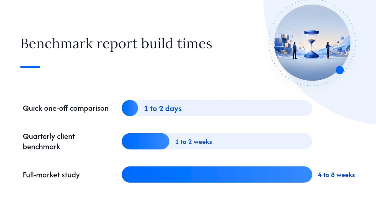
How Long Does a Benchmark Report Take to Build?
Timeline and cost scale directly with scope, and automation compresses the middle tier the most dramatically.
| Scope | Typical Timeline | Primary Roles Involved |
|---|---|---|
| Quick one-off comparison | 1 to 2 days | Analyst only |
| Quarterly client benchmark | 1 to 2 weeks | Analyst, account manager |
| Full-market study | 4 to 8 weeks | Analyst, data engineer, designer |
Automated data pipelines change this math substantially. One documented case cut per-report build time from roughly 95 minutes to about 30 minutes after connecting sources and scheduling the pulls, with commentary quality staying the same. That’s the lever worth pulling before you hire more analyst hours.
How SERPView Speeds Up Benchmark Report Production
The slowest part of any benchmark report is rarely the analysis. It’s chasing down Google Search Console exports across a dozen client properties, hitting the 1,000-row cap, and stitching CSVs together by hand.
- Connect each client’s Search Console property once and pull historical data without the row limit
- Set a metric map so keyword, page, and device data land in a consistent format across every account
- Build a scorecard using pre-built report templates, then export directly to CSV or a client-ready slide format
A dataset capped at 1,000 rows per export cannot represent a mid-sized site’s actual keyword footprint, let alone support a defensible peer comparison across several client accounts at once.
SERPView’s export capability supports up to 50,000 rows per pull, which is the difference between a benchmark built on a representative sample and one built on whatever fit inside a spreadsheet’s row cap. Pro Tip: link your benchmark scorecard directly to a shared dashboard so clients can check current standing between formal reporting cycles instead of waiting for the next quarterly deck.
One agency reporting lead’s take
Most benchmark reports fail not on the math but on the follow-through. Clients don’t remember the percentile table; they remember whether the gap you flagged turned into a fixed deadline. My rule: never present a benchmark finding without also naming who owns the next step and when it’s due.
Try the Faster Way to Build Benchmark Reports
Agencies building benchmark reports by hand usually lose the most time in one place: pulling Search Console data across client properties, hitting export caps, and manually reassembling it into something presentable. Serpview closes that gap by consolidating every client property into a single dashboard with no 1,000-row ceiling holding back your analysis.
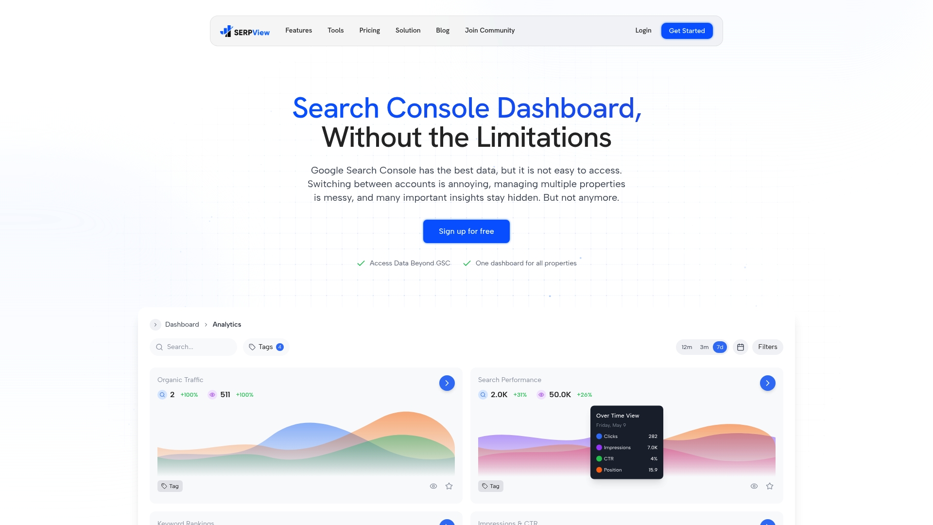
What it solves: fragmented multi-property exports that force manual stitching before you can even start comparing accounts. Typical time savings: teams cut hours off each reporting cycle by replacing manual CSV work with pre-built reports built for exactly this kind of comparison. Ready to see it against your own client accounts? Start a trial and connect your first property today.
Sources
- Service-Desk peer-group sample benchmark from MetricNet (sample PDF)
- Mixpanel — State of Digital Analytics 2026
- Benchmarking report template (DOCX and XLSX) | MarketIntelligenceTools
- Replace Client Reporting for Agencies 2026 Benchmarks Inside (Ustech Automations)
- Business Type Agency Benchmarks 2026 | Benchmarketing
FAQ
What Are Some Examples of Benchmark Reports?
Public examples include Mixpanel’s State of Digital Analytics, Klaviyo’s email benchmarks by industry, Sprout Social’s Index, and MetricNet’s peer-group service-desk benchmark, each using a different presentation style, from trend charts to percentile scorecards.
What Does a Benchmark Assessment Look Like?
A benchmark assessment typically shows a client’s metric next to a peer-group figure, presented as a percentile band (P25, median, P75) or a scorecard delta, with the peer group and timeframe stated alongside the numbers.
What Are the Steps in Building a Benchmark Report?
The core steps are: define objectives and scope, select KPIs, choose a peer group, collect and normalize data, analyze deltas, prioritize findings, and package recommendations with owners and deadlines.
What Does a Finished Benchmark Report Typically Include?
A finished report usually includes an executive summary, a methodology section naming the peer group and timeframe, a metric-by-metric comparison table or scorecard, and an action plan tying each finding to a specific owner.
How Do I Benchmark My Agency Against Competitors?
Filter peer agencies by size, service offer, and spend band, then compare delivery metrics like retention rate and billable utilization using median and percentile figures from a source like Benchmarketing rather than a single blended industry average.
Recommended
Ready to unlock your full GSC potential?
SERPView helps you access all your Google Search Console data without limitations. Start your free trial today.
Get Started Free