How Agencies Present Search Data Visually
SERPView Team
SEO Analytics

TL;DR:
- Effective search data visualization helps agencies communicate insights clearly and make faster decisions. Using specific chart types and limiting dashboards to key metrics enhances client understanding and strategic focus. Combining real-time dashboards with narrative reports boosts engagement and supports long-term client retention.
Visualizing search data is the practice of transforming raw SEO metrics like clicks, impressions, click-through rate, and keyword rankings into charts, dashboards, and narrative reports that clients can act on immediately. How agencies present search data visually determines whether a client sees a confusing spreadsheet or a clear story about their business growth. Teams using well-designed dashboards make decisions 40% faster and achieve 65% higher stakeholder alignment compared to raw spreadsheets. That gap explains why data visualization has become a core agency skill, not a nice-to-have. The right visual format turns a month of SEO work into a conversation about revenue.
How agencies present search data visually: the most effective formats
The chart type you choose shapes how quickly a client understands the data. Industry experts recommend line graphs for trend analysis, bar charts for category comparisons, and limiting dashboards to 3–5 core metrics for clear, actionable insights. Each format serves a specific purpose, and mixing them without intention creates noise rather than clarity.

Matching chart types to data types
Line graphs work best for showing how organic traffic or average position changes over time. A client can see a dip in march and immediately ask what happened, which opens a productive conversation. Bar charts excel at comparing performance across pages, keyword groups, or geographic markets side by side. Heatmaps reveal where users click on a page or which queries cluster around specific ranking positions, giving teams a pattern-recognition advantage that raw tables cannot provide.
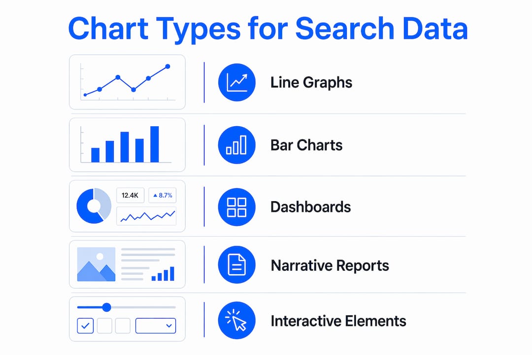
Dashboards serve as a bird’s-eye view of all these signals in one place. An effective SEO dashboard functions as a command center for decisions, compressing complex data into a single, actionable view that enables confident, fast decisions. The key word is “single.” A dashboard that tries to show everything shows nothing.
Choosing the right metrics to display
| Visual format | Best use case | Metric examples |
|---|---|---|
| Line graph | Trend over time | Organic clicks, average position |
| Bar chart | Category comparison | Traffic by page, clicks by device |
| Heatmap | Pattern recognition | Query clusters, click distribution |
| Scorecard | Single KPI snapshot | Total impressions, CTR |
| Table | Detailed drill-down | Keyword-level ranking data |
Limiting primary dashboard metrics to 3–5 high-impact KPIs prevents client confusion from data overload. This constraint forces agencies to decide what actually matters before the meeting, which is where real strategic thinking happens.
- Organic clicks: the clearest signal of search visibility growth
- Average position: shows ranking momentum across target keywords
- CTR: reveals whether titles and meta descriptions are earning clicks
- Impressions: tracks how often the site appears in search results
- Conversions from organic: connects SEO directly to revenue
Pro Tip: Build two versions of every dashboard: one for the client with 3–5 KPIs in plain English, and one for your internal team with the full technical breakdown. Clients want the story; your team needs the data.
How do agencies balance technical SEO data and client-friendly storytelling?
The biggest gap in agency reporting is not data quality. It is translation. Clients do not think in terms of crawl budget or keyword cannibalization. They think in terms of leads, revenue, and market share. Effective search data presentation techniques close that gap by connecting every metric to a business outcome.
Here is a practical process agencies use to build that connection:
-
Start with the client’s goal. Before selecting a single chart, identify whether the client cares about brand awareness, lead generation, or e-commerce revenue. This goal becomes the filter for every metric you include.
-
Map metrics to outcomes. Organic traffic growth maps to brand reach. Keyword rankings map to competitive positioning. Conversions from organic search map directly to revenue. Label your charts with the business outcome, not just the metric name.
-
Separate branded from non-branded keywords. Custom dimensions like branded vs. non-branded keywords help agencies align search data visualization with client revenue goals. Branded traffic tells you about loyalty; non-branded traffic tells you about market growth. Clients understand that distinction immediately.
-
Add benchmarks and context. A 2.5% CTR means nothing without context. Show the industry average, the client’s historical baseline, or a competitor category benchmark alongside every key number. Context converts data into insight.
-
Write a one-sentence summary for every chart. Place it directly below the visual. “Organic clicks grew 18% month over month, driven by new rankings for product-category terms.” That sentence does more work than the chart itself.
Pro Tip: Replace technical SEO terms in client-facing reports with plain-English equivalents. “Average position” becomes “where you rank on Google.” “Impressions” becomes “how often Google showed your site.” Clients engage more when they understand every word.
Translating complex SEO terms into plain-English business outcomes using custom data dimensions tied to revenue relevance is the defining skill of high-performing agency reporting teams. Agencies that master this translation retain clients longer because clients can see the value clearly.
What reporting structures support effective search data visualization?
Successful agencies use two reporting layers, not one. Interactive dashboards handle real-time monitoring. Periodic narrative reports handle strategic analysis. Each layer serves a different purpose, and neither replaces the other.
Interactive dashboards provide real-time client access and foster transparency, while narrative reports provide strategic analysis that dashboards alone cannot deliver. This two-tier approach improves data agility and prevents data fatigue.
What live dashboards do well:
- Surface ranking changes and traffic shifts the moment they happen
- Allow clients to check performance between scheduled calls without emailing the agency
- Support team alignment by giving everyone access to the same numbers
- Enable filtering by date range, device type, or keyword group for focused analysis
- Connect multiple data sources, including Google Search Console data, into one unified view
What narrative reports add:
Monthly or quarterly narrative reports give agencies space to explain why something happened, not just what happened. A dashboard shows that traffic dropped in october. A narrative report explains that a Google core update affected informational content, identifies which pages were hit, and recommends a content refresh plan. That analysis is what clients pay for.
Serpview supports this dual structure by consolidating data from multiple properties into a single dashboard that removes the 1,000-row restriction of standard Google Search Console exports. Teams can access up to 50,000 rows of data, which means the underlying dataset for both live dashboards and narrative reports is far more complete. The shared dashboard feature lets agencies give clients live access without requiring a login to every underlying platform.
What are common pitfalls in visualizing search data?
Many agencies overwhelm clients by presenting too many metrics or raw data without context, which reduces report value and client understanding. This is the most common failure in agency reporting, and it is entirely avoidable.
Poor data visualization undermines agency credibility by causing confusion. Effective visuals tap into natural human pattern processing. When a chart requires more than ten seconds to interpret, it has failed its purpose.
The most damaging pitfalls are:
- Data dumps without narrative. Sending a spreadsheet with 500 keyword rows is not a report. It is homework you are assigning to the client.
- Wrong chart for the data type. Pie charts for time-series data or line graphs for category comparisons force clients to do mental work that the chart should do for them.
- Inconsistent date ranges. Comparing this month’s data to a different prior period across different charts creates false impressions of growth or decline.
- Missing business context. A ranking improvement from position 8 to position 4 is significant. Without explaining what that means for expected traffic and leads, the client cannot appreciate the result.
Pro Tip: Before sending any report, ask yourself: “Could my client explain this chart to their CEO in one sentence?” If the answer is no, simplify the visual or add a plain-English summary line.
Visualization that aligns chart size, color, and position prioritizes attention to critical metrics, improving insight clarity. Use the largest elements, brightest colors, and top positions for the metrics that matter most. Everything else should recede visually.
What role does interactivity play in search data visualization?
Interactive dashboards change how clients engage with search data over time. Static PDF reports get reviewed once and filed. A live dashboard gets checked repeatedly, which keeps the agency’s work visible and top of mind.
Persistent visual timelines improve user engagement and usability when resuming search tasks after several days. That finding applies directly to client dashboards. When a client returns to a dashboard after a week, a persistent timeline helps them immediately reorient to where performance stands and what has changed.
Interactivity also enables drill-down analysis that static reports cannot support:
- Filter by search intent category to see which query types drive the most conversions
- Toggle between mobile and desktop performance to identify device-specific gaps
- Zoom into specific date ranges around site changes or algorithm updates
- Group content by topic using content groups to see which subject areas perform best
The risk with interactivity is complexity. A dashboard with too many filters and toggles becomes as confusing as a spreadsheet. The best practice is to expose three to five filters by default and hide advanced options behind an expandable panel. Clients who want depth can find it. Clients who want a quick check get it immediately.
Key takeaways
Agencies that master search data visualization turn complex metrics into clear client conversations that drive faster decisions and stronger retention.
| Point | Details |
|---|---|
| Choose chart types deliberately | Line graphs show trends; bar charts compare categories; heatmaps reveal patterns. |
| Limit dashboards to 3–5 KPIs | Fewer metrics create focus and prevent clients from losing the main story. |
| Separate branded and non-branded data | This split connects keyword performance directly to revenue and market growth goals. |
| Use two reporting layers | Live dashboards handle real-time monitoring; narrative reports explain strategy and context. |
| Add plain-English summaries | One sentence below each chart does more work than the visual alone. |
What I have learned about search data visualization after years in the field
The agencies that win client renewals are not the ones with the most data. They are the ones with the clearest story. I have seen technically excellent SEO teams lose clients because their reports looked like database exports. I have also seen agencies with modest results retain clients for years because every report made the client feel informed and confident.
The uncomfortable truth is that most agencies spend 80% of their reporting time pulling and formatting data, and about 20% on the narrative that actually matters to the client. That ratio needs to flip. The chart is just the container. The sentence you write below it is the product.
My strongest recommendation is to build your KPI selection process before you build your dashboard. Sit with the client, agree on three to five metrics that connect directly to their business goals, and lock those in as your primary visuals. Everything else becomes a supporting detail. When you do that, your reports stop feeling like data deliveries and start feeling like strategic conversations.
The integration of live dashboards with periodic narrative reports is not optional for agencies that want to scale. Dashboards keep clients engaged between calls. Narrative reports justify your retainer. You need both, and they need to tell the same story.
— Utsav
How Serpview supports agency search data visualization
Serpview gives agency teams the data depth that standard reporting tools cannot match.
Google Search Console caps exports at 1,000 rows. Serpview removes that ceiling, giving you access to up to 50,000 rows of organic search data across multiple properties in one unified dashboard. You can track performance over an extended historical period, apply customizable filters, and share live dashboards directly with clients through the shared dashboard feature. For agencies building the kind of clear, client-friendly visualizations this article describes, Serpview provides the data foundation that makes it possible. Explore the full feature set at serpview.com.
FAQ
What chart types work best for presenting search data?
Line graphs work best for showing traffic trends over time, while bar charts are ideal for comparing performance across pages or keyword groups. Industry best practices recommend limiting dashboards to 3–5 core metrics to maintain clarity.
How do agencies make SEO reports understandable for non-technical clients?
Agencies translate technical metrics into business outcomes by replacing terms like “average position” with plain-English equivalents and adding a one-sentence summary below each chart. Separating branded from non-branded keyword data also helps clients connect rankings to revenue.
What is the difference between a live dashboard and a narrative report?
A live dashboard gives clients real-time access to current performance metrics, while a narrative report explains why changes happened and what the agency recommends next. Both layers together prevent data fatigue and support strategic decision-making.
How many metrics should an agency dashboard show?
Dashboards should display 3–5 high-impact KPIs. More metrics than that cause client confusion and dilute focus from the results that matter most to the client’s business goals.
How does interactivity improve search data reporting?
Interactive dashboards allow clients to filter by date range, device type, or content category, which keeps them engaged between scheduled calls. Persistent visual timelines also improve usability when clients return to a dashboard after several days away.
Recommended
Ready to unlock your full GSC potential?
SERPView helps you access all your Google Search Console data without limitations. Start your free trial today.
Get Started Free