
55–70% of Impressions Are Mobile: Diagnose Gaps in Search Console
SERPView Team
SEO Analytics
Yes, mobile and desktop show meaningfully different results in Google Search Console, and that gap is worth your attention. Search Console reports device-segmented impressions, clicks, CTR, and position because Google runs mobile-first indexing, which means your mobile content is the baseline Google uses to rank you everywhere. Your first move: pull a device-segmented report today and check for mobile content parity and Core Web Vitals gaps before you touch anything else.
TL;DR:
- Mobile content must mirror desktop versions exactly, especially for structured data, meta titles, and images, to prevent ranking drops caused by parity issues.
- Prioritize fixing pages with high mobile impressions, a position gap of three or more spots, and CTR at least 30 percent lower on mobile to maximize traffic recovery.
- Core Web Vitals improvements like image compression and layout stabilization have the highest impact on closing mobile ranking gaps.
- Using a unified dashboard allows exporting larger data sets to identify site-wide device gaps, track improvements, and avoid the limitations of Search Console’s row cap.
- Regular device comparisons and content parity checks help detect true ranking losses versus click behavior problems, reducing reliance on manual quarterly audits.
Table of Contents
- How to Pull Mobile vs Desktop Data in Google Search Console
- Reading the Signals: Impressions, Position, CTR, and SERP Features
- Mobile-First Indexing: Why the Mobile Version Sets the Baseline
- A Reproducible Triage for Prioritizing Mobile Fixes
- Prioritized Fixes for Closing the Mobile Gap
- Why a Unified Dashboard Complements Search Console
- An SEO’s Take on Prioritizing Mobile Fixes
- Get More Out of Every Device Comparison
- Sources
- FAQ
How to Pull Mobile vs Desktop Data in Google Search Console
You get device-segmented data through one filter, but reading it correctly takes a bit more work. Here’s the sequence:
- Open Performance in Google Search Console, set your date range (90 days gives you enough volume to trust the pattern), and apply the Devices filter.
- Toggle between the Queries and Pages views with the same device filter active. Queries show you intent shifts; pages show you which URLs carry the gap.
- Export mobile results, then desktop results, as separate CSVs. Label each file clearly before you merge them, since Search Console won’t do that for you.
- Layer in country or page filters when you need to isolate whether a gap is market-specific or tied to a handful of URLs.
- When you hit the 1,000-row export cap, either slice your date range into smaller windows and export repeatedly, or pull the data through a unified dashboard built to handle larger pulls.
Pro Tip: Export the same date range for mobile and desktop before you do anything else. Mismatched date windows are the single most common reason SEOs misread a device gap that isn’t actually there.
Reading the Signals: Impressions, Position, CTR, and SERP Features
Most sites see mobile pull 55 to 70 percent of impressions, desktop 25 to 40 percent, and tablet in the single digits. That split shifts by vertical: informational and local content skews harder toward mobile, while B2B software queries often lean desktop-heavy. Knowing your baseline split matters because it tells you whether a device imbalance is normal for your niche or a red flag.
Three patterns show up constantly once you start comparing devices side by side:
- Impressions steady, CTR down on mobile. This is usually a click behavior problem, not a ranking problem. Look at title truncation or a competing SERP feature eating the click.
- Impressions and position both down on mobile. That’s a ranking loss, and it’s the pattern that should worry you most.
- A position gap of three or more spots between mobile and desktop for the same query is a meaningful signal worth investigating, not noise.
Carousels, local packs, and AI Overviews render differently on mobile screens and often push organic results further down or truncate your snippet entirely. Google’s own help community has documented how mobile layout changes shift which results get emphasis. Combine position, impressions, and CTR together, and you can usually tell within minutes whether you’re facing a click problem or a true ranking loss.
Mobile-First Indexing: Why the Mobile Version Sets the Baseline
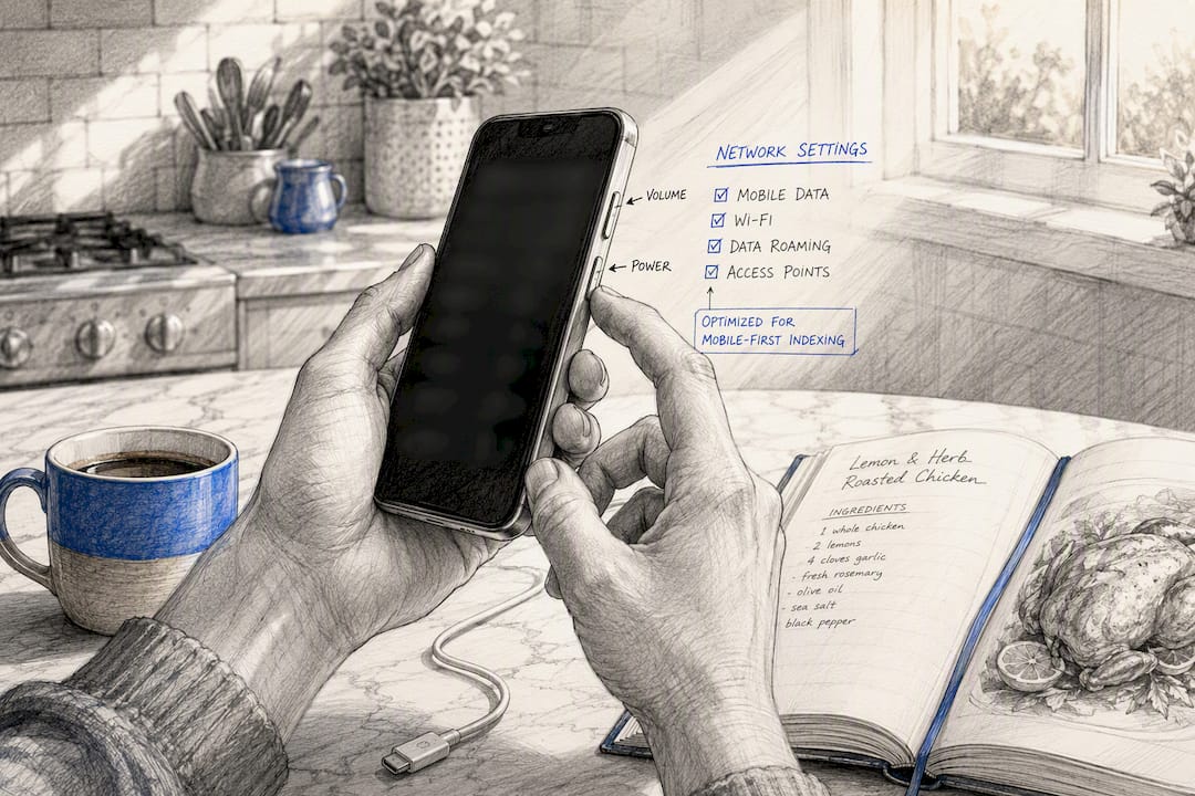
Google indexes and ranks based on the mobile version of your content, not your desktop layout. That single fact explains a lot of confusing device data. If your mobile page hides text or drops a schema block, Google ranks you on that thinner version everywhere, including desktop.
Run through this parity checklist on any page showing a device gap:
- Full primary text present on mobile, not hidden behind an accordion that never gets crawled.
- Structured data mirrored exactly between mobile and desktop versions.
- Images and their alt text intact on the mobile template.
- Meta titles and descriptions matching, with no mobile-specific truncation.
- No accidental
noindextag on the mobile URL or template.
Accordions that collapse product descriptions or FAQ content are the most common parity killer. If the crawler treats collapsed content as absent, you’ve effectively deleted it from Google’s understanding of the page.
A Reproducible Triage for Prioritizing Mobile Fixes

Not every device gap deserves your time. Use a formula before you start fixing anything: prioritize pages with high mobile impressions, a position gap of three or more, and mobile CTR running at least 30 percent below desktop for the same queries. That combination flags the pages actually costing you traffic.
Run three checks on each flagged page:
- GSC device metrics. Confirm the gap in Queries and Pages views, not just the topline Devices chart.
- Core Web Vitals by device. Mobile LCP and CLS scores often lag desktop, and poor device-specific CWV scores correlate directly with the ranking losses you’re chasing.
- A manual SERP spot-check from a clean, logged-out mobile browser session. Lock your location and language settings first, since a contaminated session gives you a false read.
| Signal | What it usually means | Next step |
|---|---|---|
| CTR down, position stable | Snippet or SERP feature displacement | Rewrite title/meta, check for competing features |
| Position down, impressions down | Genuine ranking loss on mobile | Audit content parity and CWV |
| Impressions down only | Query set narrowing or URL swap | Confirm canonical URL is stable in the index |
Watch for URL swaps too, where Google ranks a different URL on mobile than desktop for the same query. That’s usually a signal to consolidate near-duplicate pages rather than maintain two separate templates.
Pro Tip: If a page fails the CTR check but passes the position check, don’t touch your content yet. Fix the snippet first. Rewriting a page that ranks fine but gets skipped in the SERP is wasted effort.
Prioritized Fixes for Closing the Mobile Gap
Once you’ve triaged your list, work through fixes in order of impact, not order of ease.
- Core Web Vitals first. Compress and lazy-load images, defer nonessential JavaScript, and stabilize layout shift sources that spike CLS on mobile viewports.
- Content parity second. Move anything essential out of collapsed accordions and replicate every structured data block across both templates.
- Snippet and title work third. Front-load your strongest benefit or keyword in the first 50 to 60 characters so mobile truncation doesn’t cut off your best pitch.
- Ongoing monitoring last, but permanent. Set recurring exports and alerts so a CTR or impression drop gets caught within days, not months.
| Fix | Effort | Typical impact |
|---|---|---|
| Core Web Vitals cleanup | Medium to high | High |
| Content parity restoration | Low to medium | High |
| Title/snippet rewrite | Low | Medium |
| Recurring device monitoring | Low (once set up) | Compounds over time |
Why a Unified Dashboard Complements Search Console
Search Console’s 1,000-row export cap is fine for a quick spot-check but breaks down the moment you’re triaging a site with thousands of query and page combinations. A unified dashboard that pulls up to 50,000 rows changes what’s actually workable.
The workflow gets simpler once row limits stop being the bottleneck:
- Export a large historical pull covering months of mobile and desktop data at once.
- Merge mobile and desktop rows by URL to compute position gaps across your entire site, not just a sample.
- Rank pages by mobile impression volume so you fix the highest-traffic gaps first.
- Track fix impact over time using the same historical view, instead of re-pulling fresh exports every week.
That’s the practical value SERPView adds on top of Search Console’s real-user data: it doesn’t replace the baseline, it lets you actually use all of it.
An SEO’s Take on Prioritizing Mobile Fixes
Three rules have held up for me across every device audit I’ve reasoned through: check content parity before you touch anything else, since it’s the cheapest fix with the biggest ranking payoff. Prioritize pages by mobile impression volume, not by which page annoys you most. And automate your device comparisons, because manual quarterly checks miss the CTR drops that happen in week two.
Separate mobile and desktop pages are rarely justified anymore; opting for responsive web design services usually solves the problem in most cases without doubling your maintenance burden. Parity fixes on a single responsive template solve the problem in most cases without doubling your maintenance burden. Before committing to a major mobile redesign, run a smaller reproducible test on a handful of flagged pages first. If the position gap closes, you’ve confirmed your fix before scaling it.
— Utsav Chopra
Get More Out of Every Device Comparison
Search Console gives you the real-user baseline, but its row limits and short data retention make site-wide device triage slow. SERPView is built for the exact workflow this article walks through: export up to 50,000 rows at once, keep historical device data further back than Search Console retains, and filter by page, query, or country without re-pulling data every time you need a fresh angle.
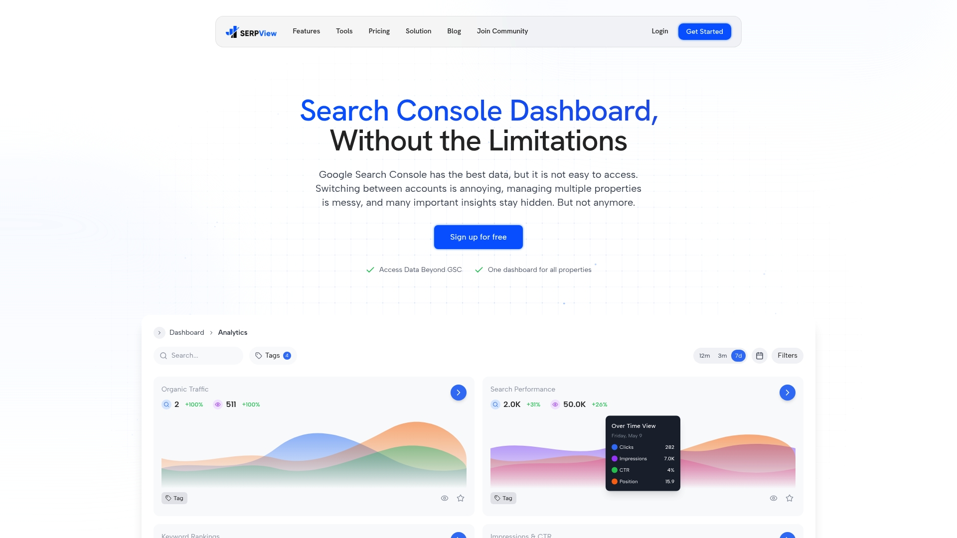
Instead of slicing exports into weekly date ranges, pull a full mobile and desktop dataset in one pass, merge it by URL, and rank your fix list by mobile impact in minutes. If you’re managing more than one property, SERPView’s shared dashboard lets your team track the same device comparisons without passing spreadsheets back and forth. Start a trial and run your first merged device report today.
Sources
- Search Console Help — Devices (Performance report)
- Mobile-first indexing — Google Search Central
- GSC Device Report: Mobile vs Desktop SEO Analysis
FAQ
Does Google prioritize mobile-first indexing?
Yes. Google uses the mobile version of your site as the primary source for indexing and ranking, so any content missing from your mobile template can hurt rankings across every device.
Why does my website look different on mobile than desktop?
Mobile and desktop use different templates, layouts, and often different SERP features like carousels or local packs, which can change what appears and in what order.
Is mobile-first design still relevant for SEO?
Yes, and it’s more relevant than ever since mobile traffic typically makes up 55 to 70 percent of impressions for most sites, with device-specific UX and performance requirements that desktop-only optimization can’t cover.
Why is my Google search different on my phone than my computer?
Location, device profile, personalization, and mobile-specific SERP features all shift results between devices, which is why locking your test environment matters before comparing rankings manually.
How do I know if a mobile ranking drop is a real problem or just noise?
Check whether the position gap between mobile and desktop is three positions or more for the same queries; smaller gaps are often normal variance, while larger ones tied to falling impressions usually signal a genuine ranking issue worth investigating.
Recommended
Ready to unlock your full GSC potential?
SERPView helps you access all your Google Search Console data without limitations. Start your free trial today.
Get Started Free