
Why Data Visualization Improves Insights for Analysts
SERPView Team
SEO Analytics
TL;DR:
- Data visualization transforms complex data into visual formats that reveal hidden patterns and support faster decisions. It enables clearer communication between technical and non-technical teams, fostering collaboration and trust. Interactive visualizations allow deeper exploration of data, leading to more accurate insights and effective action.
Data visualization is the process of converting raw, complex data into visual formats such as charts, maps, and interactive dashboards that make patterns clearer and decisions faster. Understanding why data visualization improves insights is not optional for analysts and business professionals. It is the difference between reacting to data and genuinely understanding it. Visual data insights drive business intelligence, predictive analytics, and big data projects by turning abstract numbers into clear, navigable narratives that every stakeholder can act on.
Why data visualization improves insights: the core mechanism
Data visualization works because the human brain processes visual information far more efficiently than rows of numbers. When you convert a dataset into a bar chart or scatter plot, your brain immediately begins detecting clusters, outliers, and directional trends that would take minutes to find in a spreadsheet. This is not a preference. It is how human cognition operates.

The practical result is speed and accuracy in decision making. A sales team reviewing a line chart of monthly revenue can spot a seasonal dip in seconds. The same team reviewing a raw export of 10,000 transaction records would need hours to reach the same conclusion. Translating raw data into graphical formats enables faster, clearer understanding of patterns, trends, and outliers for confident decisions.
Visualization also serves as the connective tissue between technical analysis and business action. Analysts build models and run queries. Executives need conclusions. A well-designed chart closes that gap without requiring either side to compromise their expertise.
How visualization reveals hidden patterns in complex data
The most underappreciated benefit of data visualization is its ability to surface patterns that summary statistics actively hide. A dataset with an average of 50 and a standard deviation of 10 could contain a bimodal distribution, a cluster of outliers, or a time-based spike. The average tells you none of that. A histogram or scatter plot tells you all of it.
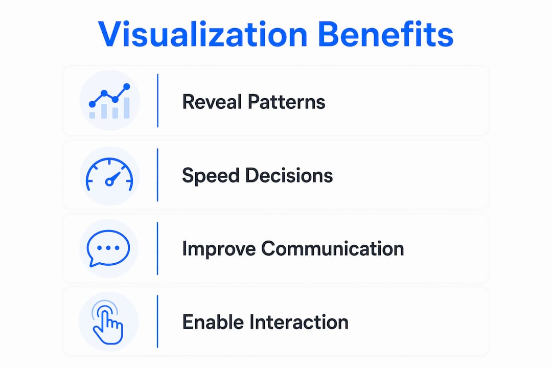
Organizations using visualization tools gain competitive advantage by filtering noise and focusing on KPIs to identify hidden important patterns. Real-time monitoring of metrics like delivery delays or traffic drops becomes possible when those metrics are plotted visually rather than buried in tables.
Choosing the right chart type determines what you find. Different chart types serve different analytical tasks:
- Bar charts compare discrete values across categories, such as revenue by region or clicks by keyword.
- Line charts show change over time, making them ideal for tracking trends in traffic, conversions, or engagement.
- Heat maps reveal density and concentration, useful for identifying which pages or time slots generate the most activity.
- Scatter plots expose relationships and correlations between two variables, such as ad spend versus conversion rate.
- Box plots display distribution, median, and outliers simultaneously, giving analysts a complete picture of data spread.
Pro Tip: Before selecting a chart type, write down the specific question you want to answer. The question determines the chart, not the other way around.
How does visualization strengthen team communication?
Data visualization functions as a shared language between technical and non-technical professionals. An analyst can spend hours building a regression model, but a single well-labeled chart communicates the finding to a marketing director in under a minute. Converting complex analysis into clear, concise narratives promotes alignment and quicker action across teams.
Cross-functional collaboration improves when everyone references the same visual. Marketing, product, and operations teams each interpret data through different lenses. A shared dashboard removes ambiguity by anchoring every conversation to the same numbers, displayed the same way. Serpview’s shared dashboard feature applies this principle directly, giving teams a single live view of search performance data without version conflicts.
Dashboard visualizations consolidate data for rapid stakeholder interpretation and enable real-time situational awareness and strategic planning. KPI tiles, heat maps, and scorecards make performance tracking easier across organizations by reducing the time between data update and business response.
Misleading visuals destroy the trust that good visualization builds. A truncated y-axis makes a small change look dramatic. A pie chart with 12 slices communicates nothing. Analysts who present data visually carry a responsibility to represent it honestly. Resources like ethical visualization standards help teams build that discipline into their workflow.
Pro Tip: Always start your y-axis at zero for bar charts. Truncating the axis exaggerates differences and misleads stakeholders who do not scrutinize the scale.
What makes interactive visualization better for decision making?
Static charts answer one question. Interactive dashboards answer many. The shift from static output to navigable interfaces represents a fundamental change in how analysts and business professionals explore data.
Interactive visualization platforms enable users to drill into charts and data, facilitating deeper exploration and discovery of subtle patterns invisible in summaries. When you can filter by date range, segment by device type, or zoom into a specific traffic spike, you stop reading a report and start conducting an investigation.
The practical workflow looks like this:
- Start with the overview. Load the full dataset in a summary view to identify which metrics need attention.
- Apply filters. Narrow by time period, segment, or category to isolate the area of interest.
- Drill down. Click into a data point to see the underlying records or a linked view that explains the trend.
- Form a hypothesis. Use what you see to propose a cause, then test it by adjusting the filters or adding a new variable.
- Share the finding. Export the specific view or share a live link so stakeholders see exactly what you see.
Interactive experiences enable exploration beyond static images, improving the discovery of nuanced behavioral patterns that aggregate statistics miss. A monthly average can look stable while weekly data shows wild swings. Interactivity lets you catch that discrepancy before it becomes a costly mistake.
Serpview’s custom alerts feature extends this principle by notifying analysts when a metric crosses a defined threshold, turning passive monitoring into active pattern detection.
Pro Tip: Use linked views in your dashboards. When clicking a bar in one chart updates a related table or map, you create a feedback loop that accelerates insight discovery.
Data visualization best practices for accurate analysis
Good visualization design is not about aesthetics. It is about honest, clear communication of what the data actually shows. Visual encodings like dots, lines, and bars must be chosen carefully to communicate patterns and causality effectively.
The most common mistakes analysts make when building visuals:
- Using default chart settings. Default settings often lead to misleading visualizations. Good visualization requires deliberate decisions about axes, scales, and which variables to display.
- Overloading a single chart. Plotting eight variables on one line chart creates confusion, not clarity. Split complex comparisons into multiple focused charts.
- Ignoring uncertainty. Presenting a point estimate without confidence intervals or error bars overstates certainty and misleads decision makers.
- Choosing decoration over function. 3D effects, gradient fills, and unnecessary gridlines add visual noise without adding information.
Clear visual comparisons optimized for analytic tasks, with proper encodings and labels, avoid misinterpretation. Decoration should never compromise clarity.
Understanding how human perception works also improves design quality. Cognition and perception principles are essential for effective visualization. Good designs leverage the human capacity to detect size, shape, and color differences to process data quickly. For practical guidance on applying these principles, the data visualization best practices framework from R2N Software offers a structured approach for analysts working with complex datasets in 2026.
Key Takeaways
Data visualization improves insights by converting complex datasets into visual formats that reveal patterns, support collaboration, and enable faster, more confident decisions.
| Point | Details |
|---|---|
| Visualization reveals hidden patterns | Charts expose clusters, outliers, and distributions that summary statistics compress or hide entirely. |
| Chart type determines what you find | Match the chart to the analytical question: bar for comparison, line for trends, scatter for relationships. |
| Interactivity deepens exploration | Filtering, drilling, and linked views let analysts investigate causes, not just observe outcomes. |
| Honest design builds stakeholder trust | Avoid truncated axes, overloaded charts, and missing uncertainty indicators to represent data accurately. |
| Visualization belongs early in analysis | Inspecting data visually before modeling prevents costly errors caused by hidden structural breaks. |
Visualization as analysis, not just presentation
Most analysts I have worked with treat visualization as the last step. You build the model, run the query, get the number, then make a chart for the slide deck. That sequence is backwards, and it costs you real insight.
Visualization should be treated as an early analytical tool, not just a final step. Plotting your data before you model it exposes structural breaks, bimodal distributions, and relationships that summary statistics compress or obscure entirely. I have caught data quality issues, mislabeled segments, and unexpected seasonality patterns simply by looking at a scatter plot before writing a single line of analysis code.
The other mistake I see constantly is treating visualization as a neutral act. Every design choice you make shapes what the viewer concludes. The scale you choose, the color you assign to a category, the chart type you default to. These are not cosmetic decisions. They are analytical ones. Analysts who recognize this responsibility produce work that is both more trustworthy and more persuasive.
My practical advice: build a rough visual of every dataset before you do anything else. It takes five minutes and it will save you from building an entire analysis on a flawed assumption. Treat the chart as a thinking tool, not a reporting tool.
— Utsav Chopra
Serpview brings visualization to your search data
Search analytics generates some of the most complex, high-volume data that business teams work with daily. Serpview addresses this directly by giving analysts and SEO professionals a unified dashboard that consolidates data across multiple properties, without the row restrictions that limit standard tools.
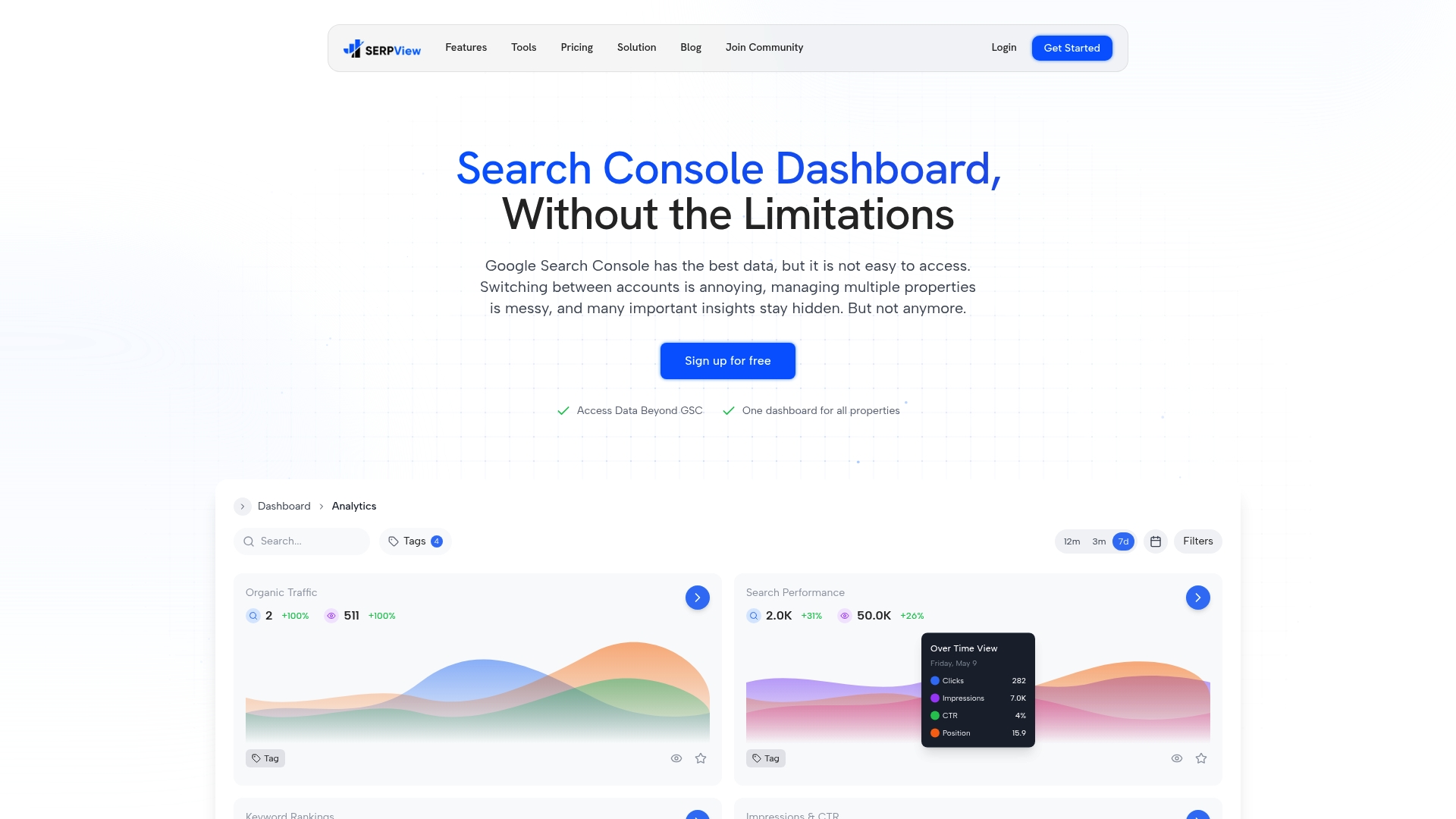
Serpview’s custom annotations feature lets you mark site changes, campaign launches, and algorithm updates directly on your performance charts. That context turns a traffic dip from a mystery into an explained event. Combined with up to 50,000 rows of data and real-time updates, Serpview gives your team the visual depth needed to move from observation to decision with confidence. Explore Serpview’s full feature set at serpview.com.
FAQ
What is data visualization in simple terms?
Data visualization is the practice of converting raw data into charts, graphs, maps, and dashboards so that patterns and trends become immediately visible. It makes complex datasets easier to understand and act on.
Why does visualization improve decision making?
Visuals reduce the cognitive effort required to interpret data, allowing analysts and business professionals to spot trends and outliers faster than reviewing raw numbers. Faster pattern recognition leads to faster, more confident decisions.
What chart type is best for showing trends over time?
Line charts are the standard choice for displaying trends over time because they clearly show direction, rate of change, and turning points across a continuous time axis.
How does interactive visualization differ from static charts?
Interactive dashboards let you filter, drill down, and explore linked views, enabling you to investigate the cause of a trend rather than simply observe it. Static charts answer one fixed question; interactive dashboards answer many.
When should visualization be used in the analysis process?
Visualization belongs at the start of the analysis process, not just at the end. Plotting data early reveals structural issues, outliers, and distribution shapes that summary statistics miss, preventing costly errors in later modeling.
Recommended
Ready to unlock your full GSC potential?
SERPView helps you access all your Google Search Console data without limitations. Start your free trial today.
Get Started Free